
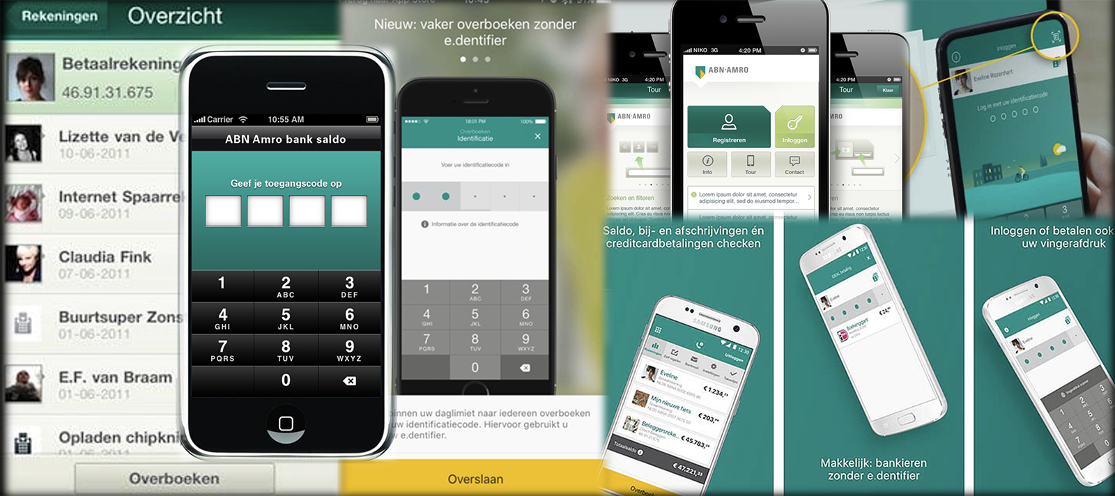
1. The previous login screens
The ABN AMRO app was introduced in April 2010. Since then, it has evolved with more app-centered banking features, a better user-centric experience, and a more distinctive tone of communication.
2. Why
Currently, the ABN AMRO retail banking app has reached the stage in which it’s not only offering banking conveniences but also a way of living. Every month, there are approximately 3.3 million Unique Visitors interacting with it through 169.5 million Pageviews.
It has been proven that products with an aesthetic-usability are perceived to be easier and more trustworthy to use. As personal finance can sometimes be a dry and stressful topic to tackle, one of my team’s missions is to investigate aesthetic details and figure out how to become more appealing and personal to users.
There are many solutions for this puzzle, one of which, that we have implemented on the app’s login, is to refresh the welcoming treatment seasonally, eventfully, and segmentally with branded illustrations.
This series of Welcoming Themes upon login also aims to redefine the simple login into a welcoming experience and pave way for more helpful and adaptive-content features in the future.
2. What
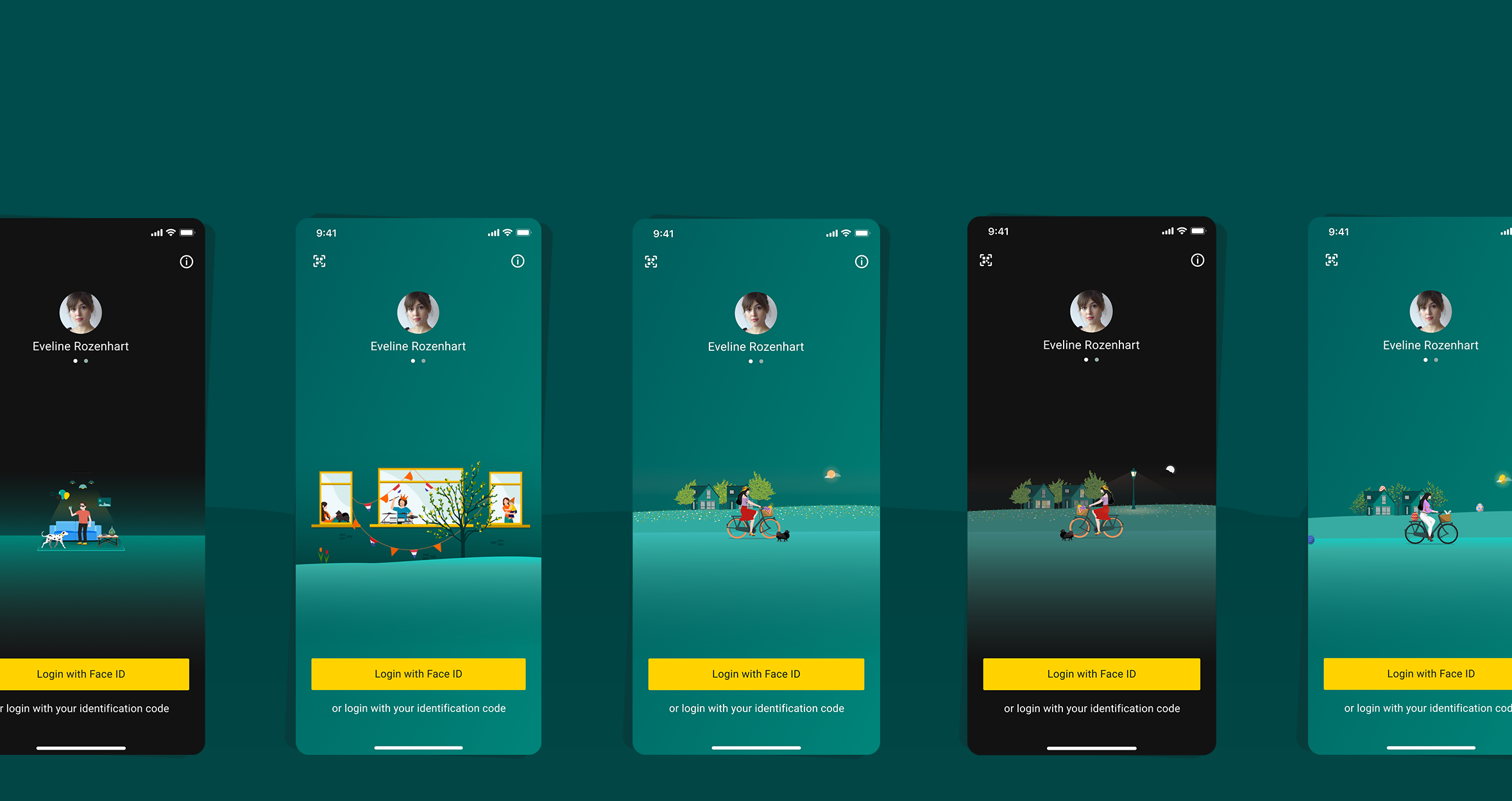
A series of branded and signature welcoming illustrations on login that rotates every season, on public holidays, to different user segments.
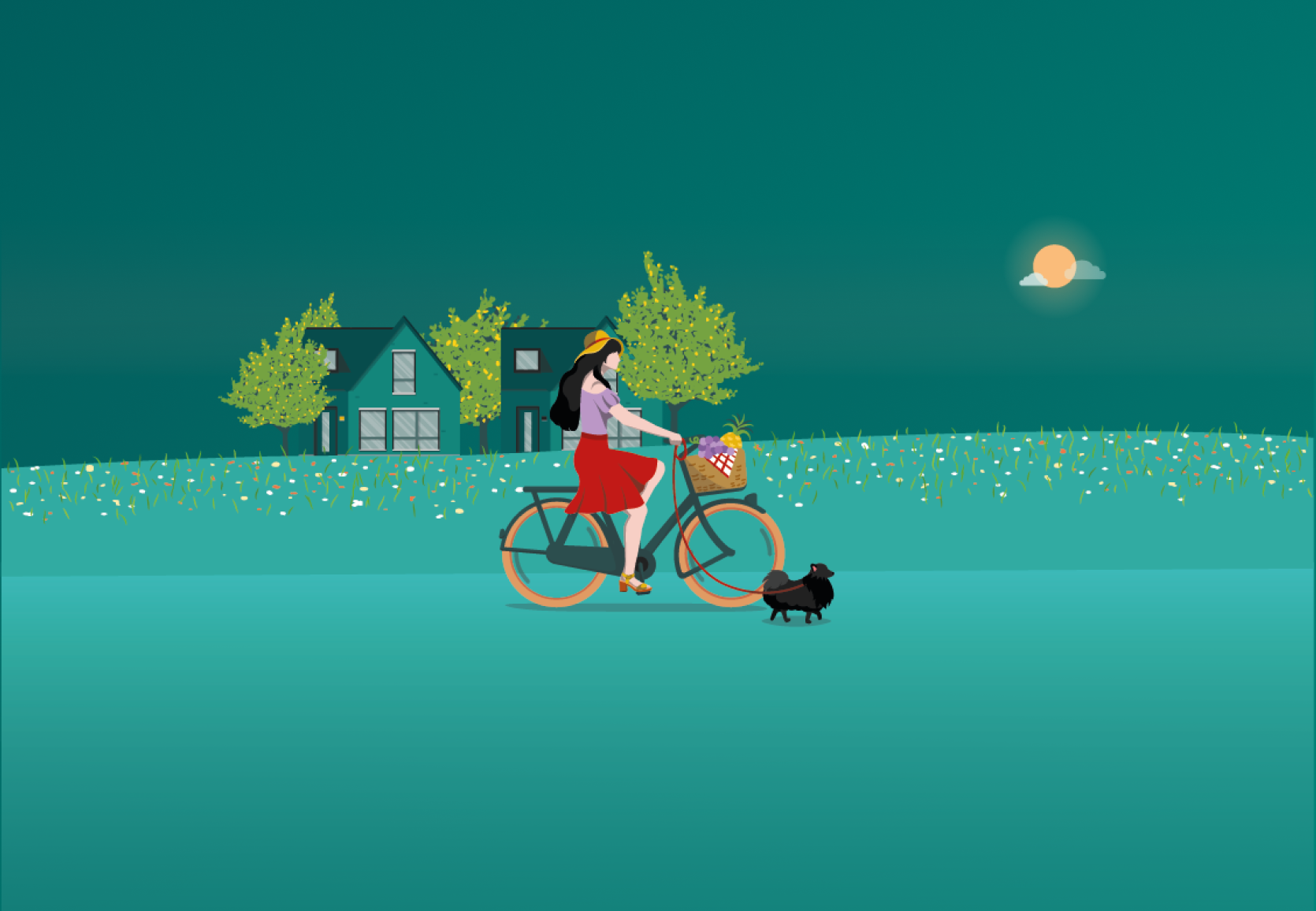
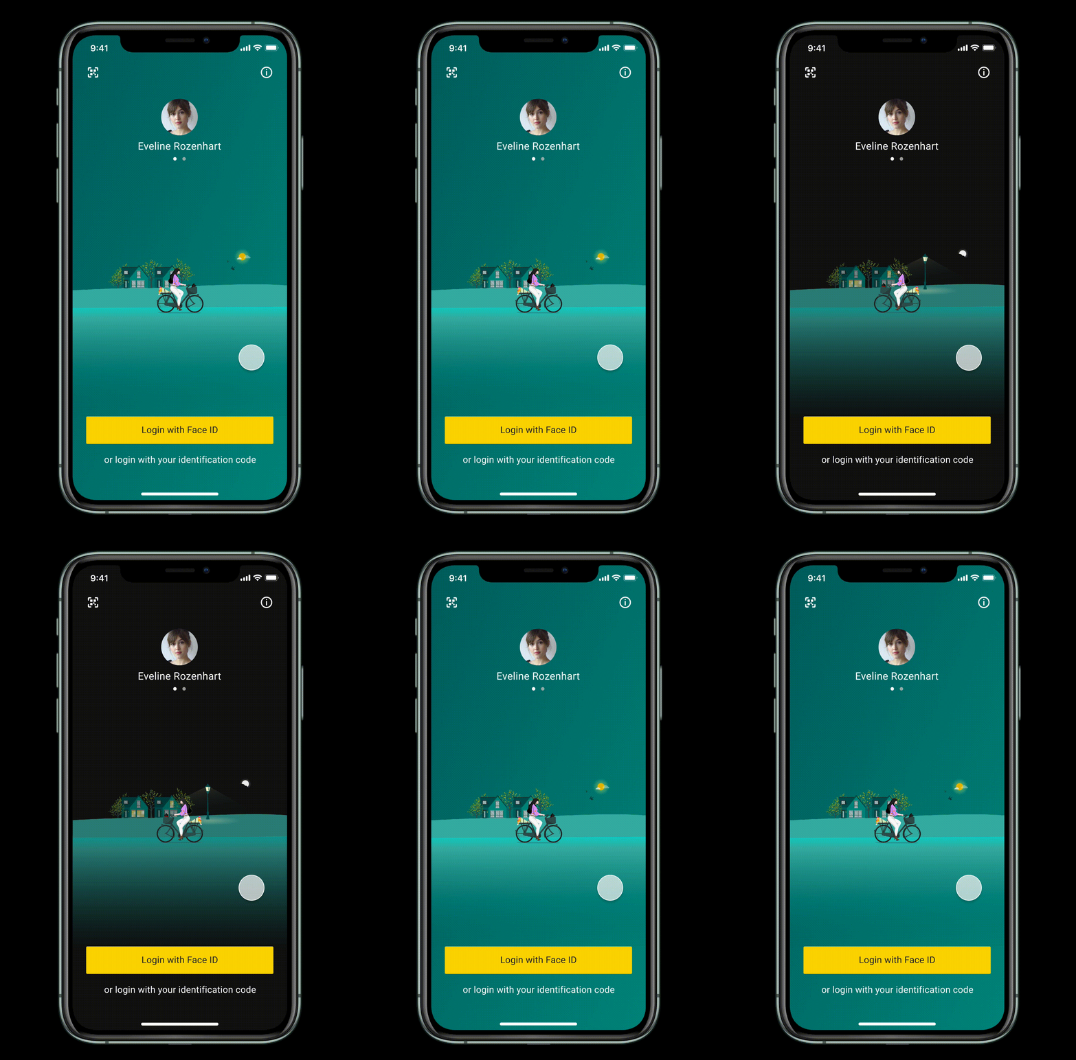
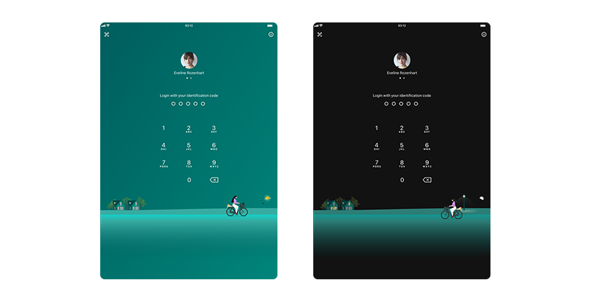
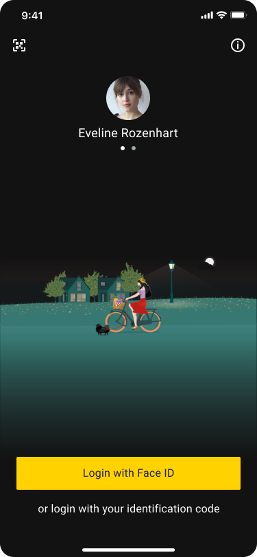
Spring 2021 / Light Mode & Dark Mode
This illustration was introduced as soon as Spring 2021 approached. It came in all app versions from 11.20 onwards in both the iOS app store and Google Play.
In the illustration, the brand’s signature “girl on a bicycle” carries some beautiful vibrant tulips in the back and a little puppy in the front basket of her bike, wandering around a neighbourhood that is blooming in sundry colours of life. I also designed a dark mode illustration version for iOS, in which the background colour is muted and the scene is altered to the girl biking under a night sky. Quality lies in details.
This was also an opportunity for me to start using pdf proof instead of png for illustrations/icons on iOS and look into the right cases to employ XML or WebP images on Android.
Easter 2021
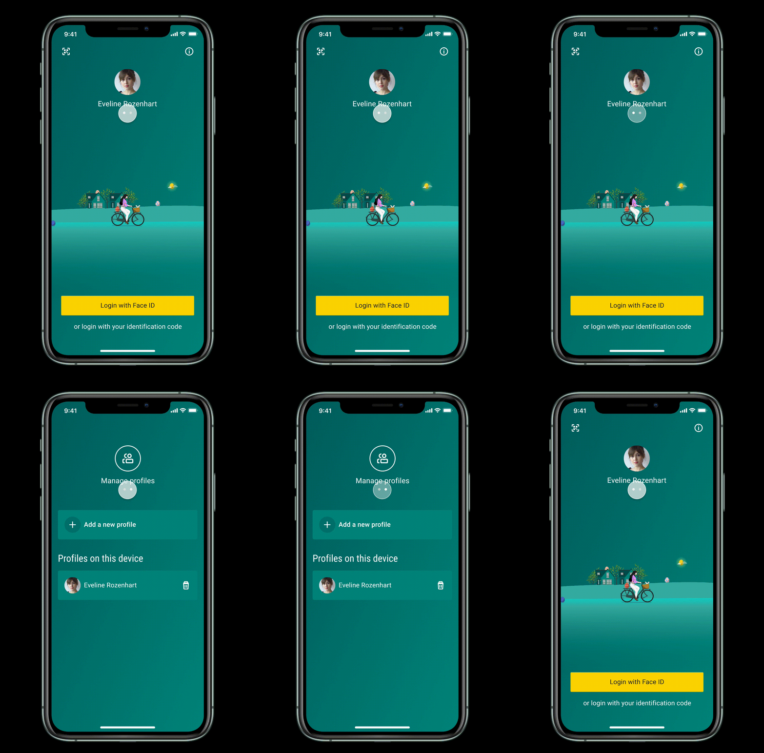
This illustration was run as a temporary campaign in line with the Easter holiday in 2021 and was viewed by 2.010.741 unique visitors.
I twisted the default Spring-themed illustration into a special Easter edition with the “girl on a bicycle” carrying a mysterious Easter bunny in her front basket while biking around the neighborhood looking for giant colorful eggs. How many eggs were you able to spot here? Is the one wearing the camouflage of the sun the most difficult to find?
I used Firebase to run and monitor the campaign. The biggest challenge was exporting this image into an optimal downsized JSON file but keeping it’s resolution quality at the same time for it to be compatible on Google Firebase.
Spring 2021 / iPad / Light Mode & Dark Mode
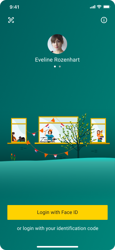
King’s Day 2021
Celebrating King’s Day together separately in the event of the COVID-19 pandemic.
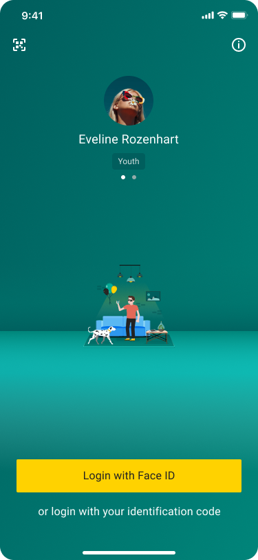
Youth Segment
I conducted qualitative research sessions with users and learnt that different user segment visioned their image with ABN AMRO differently. The youth segment particularly cared about the attractiveness aspect of the login screen and questioned to have a more relatable theme to their age bucket. This was a small touch but it contributed to nurturing a long-term relationship with the potential clients who will take their relationship with the bank to the next level when they reach adulthood.
Summer 2021
The last episode of the series before we introduced a whole new personalized login experience.
3. Metrics and learnings
We implemented tags to monitor closely user’s behavior on login every time the login background is updated. The time spent increased slightly every time the login has a new visual content to offer without affecting other interaction metrics, which can be an indicator of the login engagement rate increase.
This experiment paves way for valuable questions to tackle next and open up to new innovation ideas on login:
- How shall we automate the login theme creation process?
- Is the “girl on a bicycle” signature applicable for other segments?
- Should we enable the user to customize what they want to see?
Stay tuned. ABN AMRO login still has more to come!
4. The first building block of larger upcoming projects
This was my first task at ABN AMRO. It was a small project that helped ease me into my team. However, such small touch of care for the user was so inspirational and became the premise for our whole new epic on user segmentation.
As we looked at the findings from this project and started questioning, we wanted not to only implement here and there on the app fragmented experiments but also enable a thoroughly tailored banking app experience for different user segments on their different journeys with us.
Growth App
We decided to pursue our ambitious goal starting with the Minors segment, targeting the children who are at the beginning of financial literacy and personal banking. We own the big idea to build an ABN AMRO growth app for the children, one that offers gamified and specified features that enable the children to learn and interact with money meaningfully under their parents’ guidance. I am the lead designer behind this concept.
Welcoming Bank
Changing the login illustrations occationally is a special and nice-to-have feature but doesn’t solve the problem to welcome our users in a personally helpful way in the long run. Therefore, we took a step back and identified how an ideally new experience before login that welcomes our users the way they expect would look like. The topics we are covering and planned on our roadmap:
- A customizable welcome screen
- Personalized copy treatment
- Information before login – show what the users need when they need it
- KYC authentication


Leave a Reply
You must be logged in to post a comment.